This project began as one thing then became something totally different that I hadn’t even imagined.
My original intention was to develop an easy way to convert a digital photograph of a black and white print into a reduced-palette sketch that I could use as the foundation of an analogue collage. Got that?

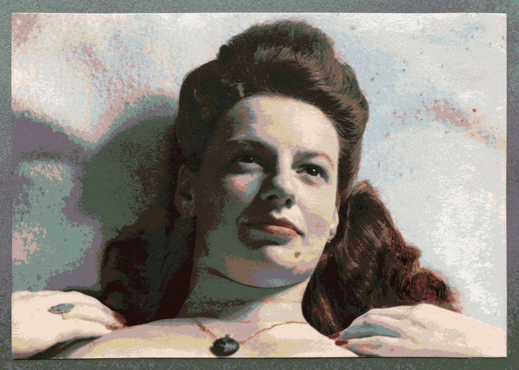
This portrait of my mother as a young woman has long been part of the family’s history even though we didn’t know much about it. The artist is possibly a photographer she worked for in Sydney’s Kings Cross (very different in those days!) or perhaps my father, who was also an avid photographer.

I opened the photo in a painting programme and used a tool to reduce the palette from 46,864 colours to 6, the number I wanted to use in my collage. This also necessitated converting the file from jpg to gif as the jpg automatically increased the palette to 7,537 colours; I assume that the format uses a lot of intermediate tints, shades, and hues to blend the transitions between colours.

Details from preparations for Portrait of Isobel Coulston 
Details from preparations for Portrait of Isobel Coulston
To make the digital painting look more like a screen print – so I’d have blocky areas that would be easy to fill in a kind of “collage by numbers” – I needed sharply defined transitions and found myself continuously making decisions about where to draw the line (bahahahaha) as I painted in the different colours. Although I started with big brushes, I always ended up decreasing the size until I was drawing individual pixels, just to keep the lines clean and smooth. This is a very intensive process that took more than 12 hours over several days to complete.

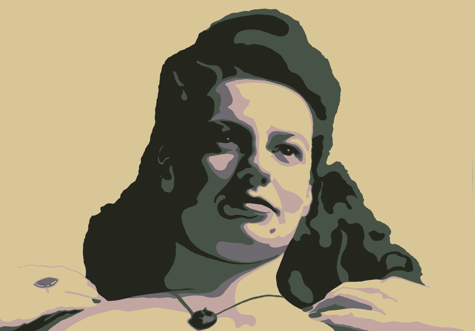
As you can see, the final drawing bears a strong resemblance to the source photo but your eye is drawn to the darkest colour: the bistre (very dark yellowish brown) irises. I like that serendipitous effect but there’s not enough detail elsewhere and the blocky parts are too blocky. Then I started on another photo from the same shoot to see what would happen.

Parts of the source image have been hand coloured, such as the make-up and jewellery, and the hair has also been extended. Mum was a professional colourist around the time the photo was made so she probably did it herself. Incidentally, this is one of the origins of “colour splash”, a digital photographic technique where most of an image is converted to black and white while a small area, such as a red shirt, retains its original colour (I’ve been playing with that technique, too, but that will be the subject of its own post). This is old school cool.
For the first version, I reduced the palette to 16 colours as an experiment. I couldn’t figure out how there were so many different colours in a black and white photo but then I remembered that it was actually an up to 16-million colour digital image of a black and white analogue photo.
The image started with 112,883 colours because of the painted areas and gradations; the algorithm that reduces the palette has to keep red for lipstick and fingernails, green for jewellery, and pink for skin as well as black and white. In actuality, the palette stayed mostly within the brown spectrum with black replaced with “Seal Brown” and white with “Alabaster”. There are also greens like “Tahuna Sands” and “Grey Asparagus”. I kid you not.
In this transitional image (note that I haven’t finished blocking the hair yet) you can see that the palette reduction has created contour lines. These intermediate colours have been reused by the programme to create highlights and shadows. It’s a completely prosaic action but accidentally gives an exciting sense of dimensionality.

Andy Warhol, Marilyn Monroe, 1967, screen print, 91.5 x 91.5 cm 
Shepard Fairey, Hope, 2008, print on paper, approximately 86 x 61 cm
I get vibes of Andy Warhol’s Marilyn Monroe and Shepard Fairey’s Hope poster of Barack Obama, both extant influences in the aesthetic areas of my brain.

I really like the completed image. The pose gives a strong triangular shape but the gaze out of the picture frame breaks the composition. There is plenty of detail in the face but it is surrounded by lots of negative space to ease the eye. The dynamic range of light and shade created by the high key lighting gives power and drama.
Having learned many things from this portrait, I went back to the first work and started again to see what would happen. This time, I converted the black and white photograph to 16 colours before blocking out the different areas.
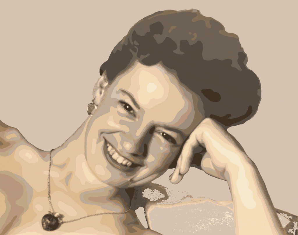
I was wary of the fine details, such as the eyelashes and jewellery, as they’d caused much angst the first time. You can only make a finite number of good decisions in a day and this process uses up all of them!
One of the better decisions I made was to remove the entire background and replace it with a darker colour, reducing the overall brightness of the image, softening the look, and pushing the subject forward.

The original portrait captured mum’s bubbly nature and some of her wicked sense of humour. My contour lines make it somewhat abstract and I’m fascinated by the push/pull between photographic fidelity and digital weirdness. Eyelashes remain the least satisfactory aspect because in real life, the fine detail disappears or becomes overstated. The necklace chain is perhaps a little too photorealistic but I still don’t have a solution that doesn’t involve too much detail with three colours and not enough with two.
Of course, I couldn’t use this image as the basis for a collage, so I was fiddling around with different settings trying to make it more useable and accidentally produced something even stranger: an ultra-high contrast version that increases the vibrancy of the palette and adds emphasis to the darkest areas. Wow!

I haven’t done any collages of these pictures; mostly driven by the difficulty my supplier has in sourcing bulk, metallic, star-shaped stickers. I have, however, completed another 20-odd transformations; I’ll be showing these in my Instagram feed over the next few months and working on some more photos I’ve identified as likely candidates.
