
Earlier this year, I painted a mural (Flowers) based on an ongoing love affair with flowers and pop art; Liam told me that it reminded him of Takashi Murakami’s Flowers Red Velvet so I looked that up and yup, it totally would.
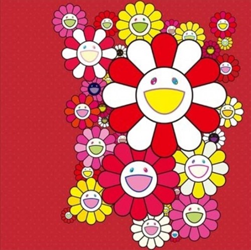
Murakami is best known for creating the “superflat” style from Japanese cultural forms such as ukiyo-e woodcuts, pop art, manga, anime, and kawaii (cuteness). It is characterised by dark outlines and solid, flat planes of colour.

This style happens to resonate well with eX de Medici’s watercolour Asleep while Awake, in which she squeezes all the depth out of bold flora and surreptitious technology. Even though compositional contrasts – mechanical/botanical, cool/warm, pixelated/detailed – push the spy device forward out of the feathery poppy leaves, she subverts this effect by squashing everything into one shallow plane.

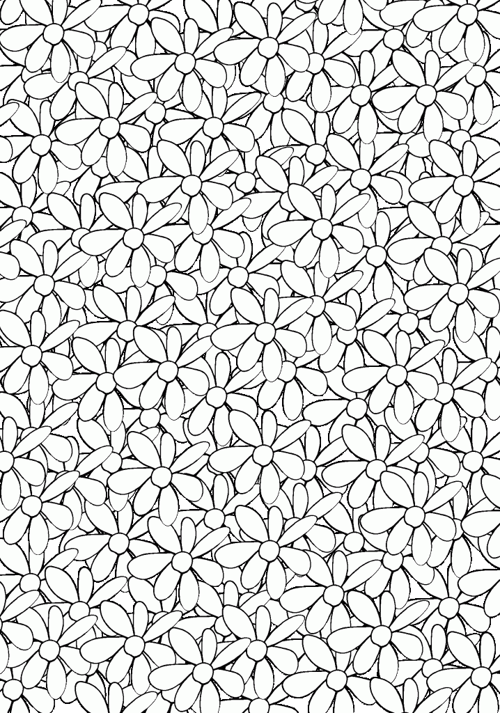
I experimented with mixing these works to find a way to make one flower the focal point in a field of flowers, mostly by playing with the imagery and developing sketches past the point where I would normally stop, i.e. until there was literally no room left on the page for mark-making.

I played with different colours and methods of overlapping.

Have I mentioned that I really like lots of bold colour?

These pen-on-paper sketches are fun and generate lots of ideas.

So much fun! I love it when doing art inspires me to do more art.

Unfortunately, my naturally loose style isn’t conducive to replicating the superflat effect. Murakami’s works are too regular to be hand-drawn so, without knowing his process, I digitise some flowers and, after a frustrating session wrangling the printer settings, I manage to create big, flat fields by copying and pasting, pasting, pasting.
Kylie suggests that I consider the change to digital as an entirely new medium rather than an automation of the analogue technique and this really helps me understand what I’m doing. She also points out that contrast controls spatiality.

It quickly becomes clear that although useful, these A4 tests are too small for me to experience the effect that I’m looking for. Rochelle mentions the increased psychological power of larger images. Katrina also recommends going bigger, but draws my attention to the way that darkening the grey background would increase depth and, conversely, lightening would decrease it.
Adriana agrees that I should move to a bigger surface but suggests playing with a larger palette as the sketches remind her of childhood colouring books. She also has the idea to make a publically collaborative colouring-in work, which coincides with something I’ve been toying with for when I have more time. Ahaha.

I try mixing up the size and shapes of the flowers.

I try adding colour and shade. Rhea proposes that lots more colour would be another way to confuse depth perception. I colour in some flowers and it certainly flattens the image.

But then, while attending the Japan Supernatural exhibition at the Art Gallery of NSW, I come across this kimono pattern (when I’ve finished bingeing on the massive Murakami works and am in the little shop by the exit).
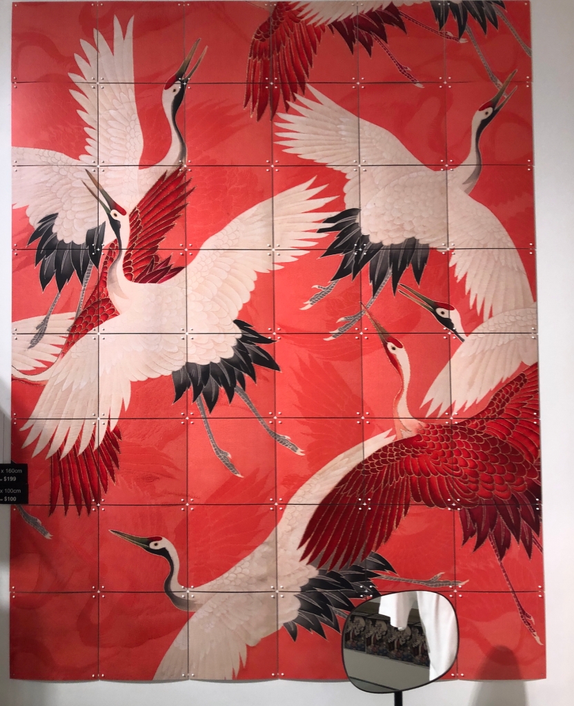
The repeated bird motif creates the same flatness. I decide to fill the frame with small flowers and plop a big one on top, just to see what it will look like.

Doink! Close, but no banana. Next, I try moving the focal flower behind the background.

Much better; more like de Medici. Sometimes though, I accidentally push a lot of wrong buttons and create interesting effects…

Ahem. I don’t know how I did that as I was actually trying to make the background black.
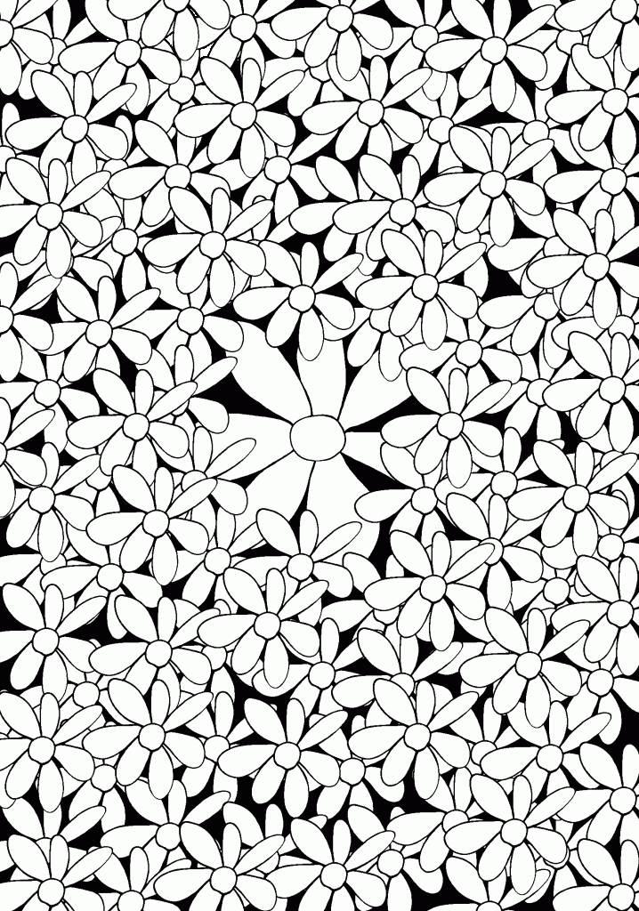
And then I try a grey background with serried ranks of overlapping flowers because life is short and why not mix it up a little?

That gives it a sense of movement which might be fun to play with later. Eventually, I increase the size to A3, which means doing battle with the out-dated printer at the library. I prevail but only after much hassle and some piquant commentary on the presence of antiquated technology in a school of art and design.

I love how the big flower becomes lost in the field of small ones.

I colour the hearts with yellow marker pen because they remind me of daisies even though they’re actually generic flower motifs.

This is interesting but there is something missing. I begin a second version, this time colouring the background light grey to add just a little depth.

It only takes this one corner to realise that I will go crazy trying to finish it by hand: it will be easier to redo the template.

Remember: copy and paste and copy and paste and copy and paste is your friend.

It’s a good thing I have a comfy computer chair because I’m spending a lot of time sitting in it. Finally, it’s time to colour the hearts yellow.

And at last, I can colour the heart of the focal flower a contrasting blue.

And this doesn’t work at all.
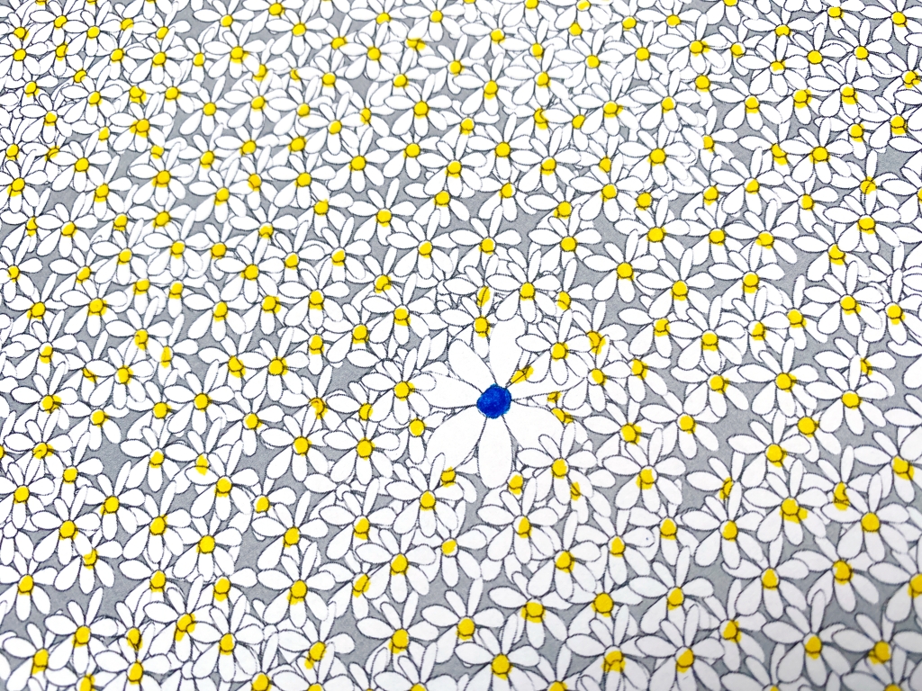
The cohesiveness of the design is completely undermined by the attention-stealing dark blob. However, I have learned a few things:
- The final image size needs to be at least A1 to have the visually overwhelming effect I want.
- The central flower will contrast by being uncoloured.
- I will remember to count the number of flowers for the title and because it’s fun. I love to count.
- Limiting the motif sizes and colour palettes is best for limiting the depth but this doesn’t connect to de Medici’s work.
- I reached a fail point when I made the focal flower too obvious. In de Medici’s painting, the weapon harmonises with the surrounding foliage through a contained and muted watercolour palette.
Seeking further inspiration, I go to the library to do some research and discover Murakami’s manifesto, in which he straight out says what superflat means. Libraries are awesome!

Meanwhile, class comments remind me that I like lots of colour so I colour the multitudinous outlines of my A3 print with a bunch of pens I have lying around (because in art, being random generates answers you didn’t know you could ask about – this is a good thing).

This change in technique allows me to be freer with my colouring and looser in application, as with my original experiments.
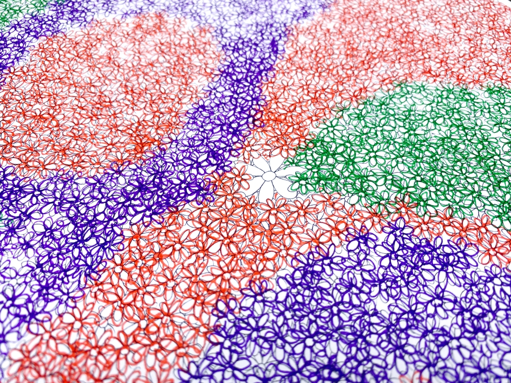
This version also looks more like eX de Medici’s detailed foliage. And with that realisation, it is time to go large.

I get an A1 version printed and I’m immediately impressed by the increase of scale. I gather all my marker pens and create flowing ribbons of colour.

The uncoloured central flower definitely draws the eye but then you get distracted by the swooshes of colour and you can’t focus on one part for more than a few seconds and it’s like falling into an explosion at a rainbow factory, which sounds like a very good thing to me.
I also remember to count the flowers (there are 5,020) and make my best ever tally mark while doing so.

This first assessment is designed to lead directly into the second, which is a great way to learn about developing a work over time by repeatedly playing with your materials, tools, and techniques. It also underlines how beneficial it is to start your university assignments as early as possible because there are things you miss out on when you rush to do them at the last minute.
You might be wondering why this post is titled “LOVEYOU”. I’d be surprised if you weren’t; I haven’t mentioned love at all. I’m not trying to be inscrutable but the important thing is that you understand that everything you’ve just read leads me to the point where I start conceptualising the next stage: my Assessment 2 picture called 6350 Flowers (LOVEYOU).

One thought on “LOVEYOU”