
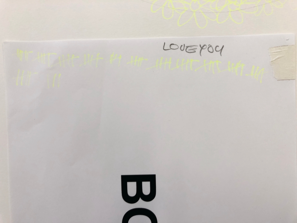
You will remember from the previous post, that the next post was going to be called LOVEYOU but this is the next post and it’s called LOVEYOUTOO. There’s a reason for that and I’ll get to it later.
To recap: drawing, flowers, superflat, colour, counting.
According to the course outline, Assessment 2 wants us to “continue to practise the processes of spatial construction already tested, developing and refining more complex and creative responses that introduce elements of sequencing and narrative.”
To wit: draw more flowers, with a story.
So, the last post left me conceptualising what I would draw. Narratively, all I could think of was the event that had hung over my life for the previous two years: my mum’s death. The only story I wanted to tell was about my presence in her life and her presence in mine.
I used this as a jumping off point to develop my previous experiments into resolved drawings.
The first thing I knew was that if I was going to do this right, I would need a bigger piece of paper. I had a 1500mm wide roll that’d been taking up space under the bed so I cut a square because the flower motif is essentially circular and will fit inside a square more comfortably than a rectangle.
I spent a long time shopping for refillable pens because I anticipated using a lot of ink but they are few and far between; also, I wanted the marks to have the look of a fine, felt-tipped pen. Eventually I settled on single-use Stabilo Point 88 pens for the finest nibs (0.4mm) and the largest range of suitable lightfast ink.
For reference I used the following colours:
- 024 Neon Yellow
- 22 Night Blue
- 32 Ultramarine
- 33 Apple Green
- 41 Blue
- 54 Orange
- 55 Violet
- 56 Pink
- 89 Ochre
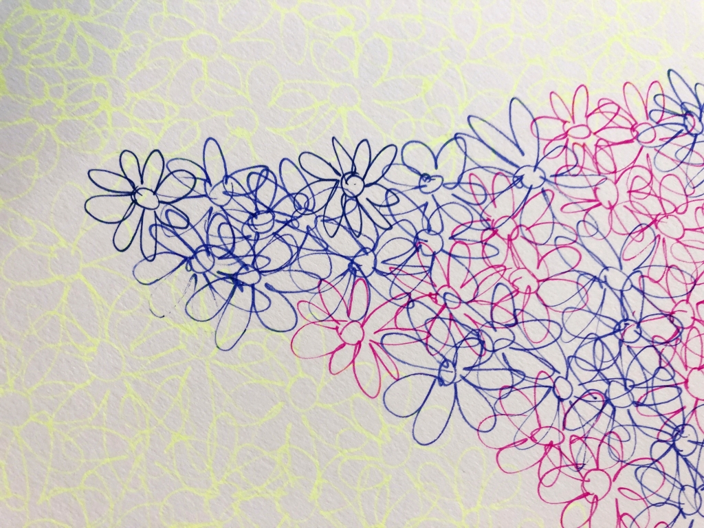
I used our Studio Art Practice studio on campus because of the large tables but I started on the floor, sketching a large flower motif in graphite then filling in the petals with 630 yellow ink flowers, erasing the pencil as I drew to generate the satisfied sense of a job completed. I figured I would need the encouragement as this would be a long task.

Also, it’s hard to see neon yellow on white paper without my glasses but I can’t wear them for long periods of time so I crushed the life out of the first pen by pressing too hard to make thicker lines that I didn’t even need. And as other colours were added, the yellow will stood out more clearly. Art is a learning process!
My parents fostered in we kids a great love of nature through gardening, visits to friends’ gardens, expeditions to wild places, and excursions to the country. Later, when mum couldn’t get out as much as she wanted, she told me she really enjoyed the many photos of flowers that I shared on social media. That made me really happy because she was ever my hardest critic and most ardent supporter. It was good to return some joy.
As I drew, I recalled the final words my mother said to me before she died. It becomes a Zen mantra, bringing calm and focus. I liked it so much that I decided to work them into the drawing sometime later.
Then there was a coronavirus lockdown and most of the buildings on campus were locked. The one large room that was open just happened to have some big tables, so I moved my practice to the student union (Arc) common room.

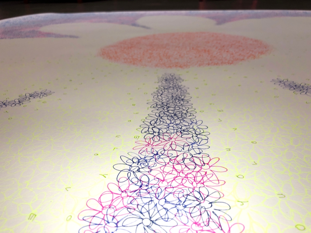
Once I’d completed the flower background, I began writing “LOVEYOU” with one letter in each flower heart.

This required cushions so I could reach the centre of the paper from every angle. Attaching the paper to a wall would’ve been just as challenging because of the range of heights at which I’d have to work, not to mention all the twisting and turning.

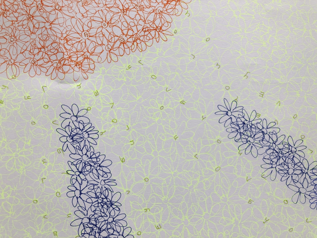
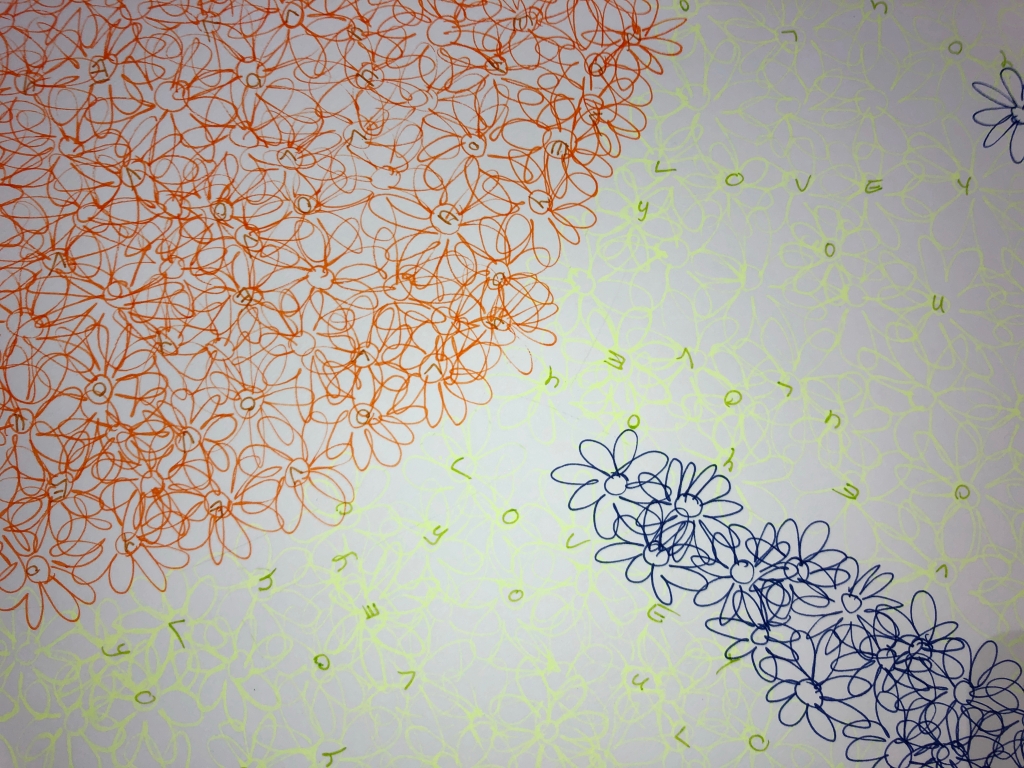
For the text, I chose colours close to the background flowers, making it invisible until you approach the work quite closely.

I like surprises.

I’m sorry about the quality of the image but I only had access to a phone camera because of the coronavirus lockdown. Also, squeezing a drawing that’s one and a half metres on a side into a computer screen doesn’t allow for fine detail.
Then I had to think about doing a second picture that responds to the first in conversation.
Far Too Many Words
In starting this piece, I wanted to return to the loose and informal drawing style with which I started Assessment One as this work represents me, in the same way that 6350 Flowers (LOVEYOU) represents my mother.
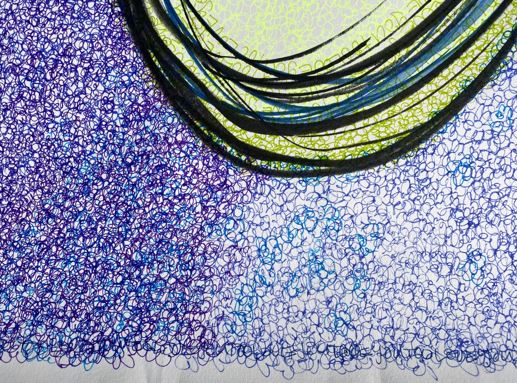
I adapted an exercise from Drawing 1, holding five marker pens – four black and one blue – in one hand (big hands come in useful) and using them to sketch the outline of a flower onto another 150 x 150 centimetre square of paper.

The pens weren’t always in full contact with the surface because they all had chisel tips so I went over the outline a few more times with the blue pen and the largest black pen.

Then I started filling in the flower.

About this time, the entire campus was locked down so my workplace moved to a drawing board on the loungeroom coffee table as it allowed for the paper to unroll over the sides (so I can reach the middle).

I filled the heart first, and then started on the petals.

I’ve noticed that the repeated and overlaid yellow motif reminds me of a succulent (Sedum acre aureum “Gold Mound”) outside my kitchen door.

Themes I Have Noticed in this Project
- Pop Art
- Mass repetition of a motif
- Subverting the line by using objects rather than points
- Word Art
- Conceptuality: conversation between the two drawings representing the conversation in the text representing the conversation in real life
- The personal in art
- Self-directed art therapy
- Symbolism: flower images carrying information (words, emotions)
- Representation: semi-wild florescence of a herbaceous border

The Biggest Number I’ve Yet Counted To
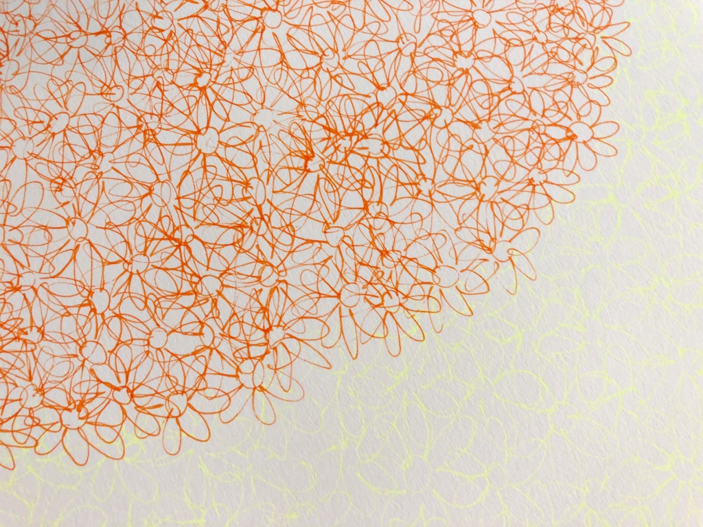
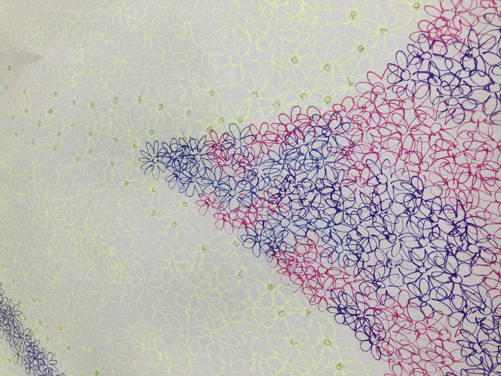
This time, I restricted my palette to seven colours: orange, ochre, yellow, green, blue, purple, and dark blue. That’s two less than I started with so quite a challenge. I added a ribbon of green flowers to soften the black outline and form a gradient from yellow petals to blue background.

I also let the small flowers bleed together to further soften the edges of the main flower.

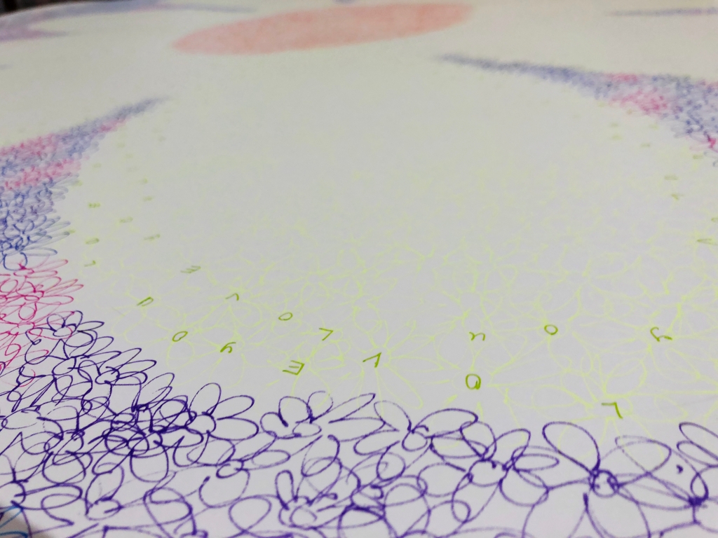
When I began adding text I decided to make the words a linear feature to mirror the black lines and further soften the transitions.

From a couple of metres away they will look like more flower motifs but as you approach they’ll resolve into words.

I also expanded orange flowers in the heart to match style of the petals. I like the way everything overlaps with motif flowing into text flowing into line. It suits the symbolic nature of the work which has emotion flowing into flower flowing into word.

These works now exist as a diptych (one picture across two surfaces) as it is a literal and symbolic conversation between my mother and me; her gift of love expressed in word and flower, received, transformed, and returned.

I like that the drawings match our characters: mum’s is more subtle and restrained, mine is bolder and looser. I liked drawing on large supports but it is so much easier with a proper studio to work in. I particularly like the multi-pen outline technique and the use of text as a visual device rather than just an informative one. Meanwhile, the outer square of text in 20100 Flowers makes an interesting framing device.
The installation view is outside (on my neighbour’s wall) and includes elements of nature (weeds, leaf shadows). This adds a new layer of meaning about being outside during the COVID-19 lockdown.
With regards my artists from Assessment One, in the first image I have definitely achieved flatness, even with the warm/advancing and cool/receding colour scheme. The outline on the second gives a clear differentiation between foreground and background but the depth remains very shallow. The dark diagonal swathe is because I picked up the wrong pen while in a gloomy room; then I had to work around the purple blob to make it more aesthetic but it echoes the final work from Assessment One. I quite like the contrast and might create a full purple background in a future work.
During the virtual group presentation, one classmate said that the pictures read like a love letter, especially because of depth of time referred to in the work (from my birth through to mum’s death).
The following videos demonstrate the effect of moving toward the images:
6350 Flowers (LOVEYOU) detail: https://vimeo.com/user112839375/review/408703332/243e69a7d8
20100 Flowers (LOVEYOUTOO) detail: https://vimeo.com/user112839375/review/408703480/bd2844115a

Katrina said the Pop Art flower motif became a signature symbol and “a great strength” in my practice. This pleases me greatly as they flow from my hand quite naturally, even by the twenty thousand (yes, “twenty thousand”).

Theo said that the textual element is “a really nice addition” while the loose lines make the second piece “visually striking and interesting both from a distance and up close”. A speculated third work will include both elements.
Ironically, I created the most superflat quality once I stopped trying to draw like Murakami and de Medici, and started using them as inspiration to do my own thing.

More Themes I Have Noticed in this Project
The 0.4 millimetre tips let me draw small flowers en masse; however the paper’s strong tooth (the texture of the surface) completely abraded the felt tip so the metal collar left fine gouges against the surface, but I am surprisingly ok with that. The tools do what the tools do and fighting against that is just an exercise in ego.
I associate flowers with my mother’s gardening and these assessments connected to the last thing she said to me before her death: “Love you.” I wrote “LOVEYOU” (one word because of my dodgy handwriting) on a tally sheet so that every mark would stir my memories. Then, inspired by other students’ use of text in an image, I added lines of LOVEYOU such that they only appear on close examination. The total number of flower motifs and this quote form the title.

The last thing I said to my mother was “Love you, too.” For me, our five-word conversation perfectly encapsulates a narrative that spans two lifetimes. Like many contemporary artists I was inspired by the intimately personal, though I hope the pictures remain accessible even if you don’t know the story behind them.
As self-directed art therapy, I found the drawing process very soothing. Being able to focus on our shared love of flowers for hours at a time has helped me begin processing my feelings of grief and loss.

