Silueto – The Nuhiti Interventions

Figure 1 – Matti, Silueto 2, 2020, bodily impression with seashells on sand

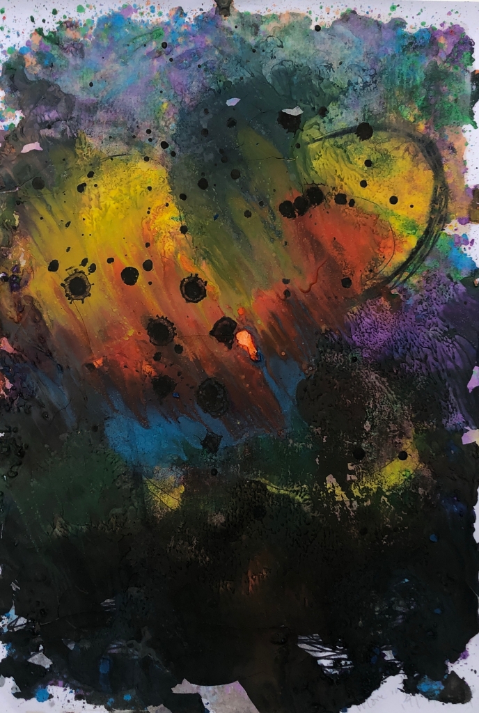
Silueto is a series of interventions marking my existence in the landscape using found materials whose ephemeral nature generates a particular aesthetic. Conceptually, each photograph records the post-presence of the body within the landscape.

That said, let’s talk about Ana Mendieta.

Figure 2 – Portrait of Ana Mendieta, source: https://hammer.ucla.edu/radical-women/artists/ana-mendieta

Ana Mendieta was born in Cuba in 1948, but at 13 was sent to the USA to escape political persecution. She earned a Masters in painting at the University of Iowa but quickly expanded her practice in Hans Breder’s new Intermedia course, a performance-led programme challenging students to create art “across and between a plurality of media and distributed and presented in a variety of contexts” (Viso et al., 2004, p. 41).

Intermedia became the first master-level syllabus in the country to introduce art students to an interdisciplinary approach, encouraging them to explore unconventional formats, combinations, principles, and materials. Intermedia students, who came from different areas of studio art (painting, sculpture, photography), performing arts (dance, theatre, music), writing, and film, attempted to integrate aspects of their individual disciplines into the development of more conceptual forms of expression. (Hertzberg, 2004, p. 138)

In an essay I wrote last year – and have cited because not doing so is plagiarism – I explored Mendieta’s sense of place as a brown-skinned, female, Cuban migrant in mid-20th century the USA (Matti, 2019).

Mendieta declared herself “between two cultures” (Brett, 2004, p. 181), a position which infused her work with “alienation and displacement” (Baker, 2016, p. 3). She located her practice specifically in a grant application:

I have been carrying on a dialogue between the landscape and the female body (based on my own silhouette). I believe this to be a direct result of my having been torn away from my homeland during my adolescence. I am overwhelmed by the feeling of having been cast from the womb (nature). My art is the way I re-establish the bonds that tie me to the universe. (Viso et al., 2004, p. 47)

I was not “cast from the womb” because migrating was a free choice for me, but I am definitely between cultures and that drives a need to understand my connection to place: when I’m in Australia, I often reminisce about New Zealand; when I’m in New Zealand, I dream of Australia.

Figure 3 – Ana Mendieta, Imagen de Yagul (Image from Yagul) from the series Silueta Works in Mexico 1973-1977, 1973, chromogenic print, 50.8 cm x 33.97 cm

Mendieta’s first Silueta is an “earth-body work” (Viso et al., 2004, p. 22) called Imagen de Yagul. As she lay naked in a pre-Hispanic tomb, covered with white flowers, Breder shot several documentary photographs. She printed just one in order to share the “deliberately ephemeral and temporal (action)” (Sabbatino, 1996, p. 162).

For the artist, each Silueta was “a private act of meditation and dedication” (Iles, 2004, p. 221) combining several art forms: Body, Feminist, Land, and Performance. Body Art is the use of the artist’s body in the artwork, as a material, surface, tool, or technique. Feminist Art is about breaking down the patriarchy so that other voices can be heard. Land Art involves using the Earth as an integral part of the work (i.e. setting, surface, and/or material). Performance Art (not quite the same as performing arts like music and theatre) involves people generating a living artwork which ceases to exist in its original form once they cease performing.

Figure 4 – Ana Mendieta, untitled Silueta, 1976, cibachrome print, 20.3 x 25.4 cm

Mendieta took her transdisciplinary nature a step further by including the documentation as part of a larger work “in the time and place of their creation and in the residues and documentation that live afterwards… both the ‘body earthwork and photo’” (Viso et al., 2004, p. 70). This let her  explore “the interstices between conceptual, performance, and land art, and how these practices intersect with feminism and the gender and identity debates” (Viso et al., 2004, p. 26).

Her attitude was directly inspired by her studies but also the zeitgeist of the 60s and 70s: traditional art’s rules were melting away under the intense scrutiny of Contemporary Art, which gave itself the freedom to question everything, even the questioning.

Figure 5 – Ana Mendieta, Untitled Silueta (Guanabo), 1981

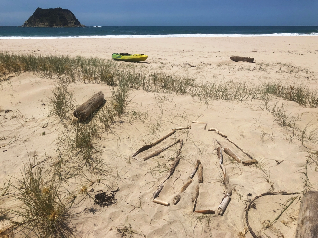
Meanwhile, this post is about my Siluetos, beginning with interventions I performed on a beach in New Zealand. Mendieta’s works are known as Siluetas (Spanish for silhouettes); “Silueto” is a neologism that honours Mendieta as progenitor while changing the feminine suffix to masculine for differentiation. I locate my practice as riffing off her original works, sharing transgression in the social space by acting outside normativity, expressing performativity as an act of meditation and dedication, and promoting environmental awareness.

My first intervention was a direct response to one of Mendieta’s: I lay on the sand and drew my outline with seaweed. Then when I stood to document the work I discovered an indentation in the sand, meaning that I’d made more of a mark than I’d intended.

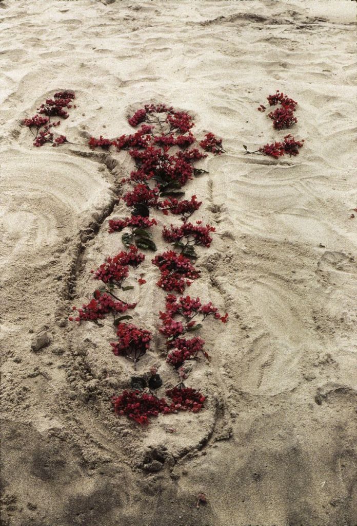
There is a clear relationship between these two works, although I find it fascinating that Mendieta’s looks female while mine looks male.

Figure 7 – Matti, Silueto 1 (installation view), 2020, bodily impression and seaweed on sand

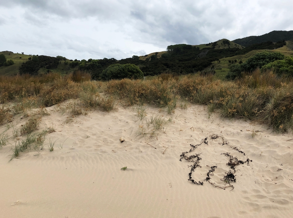
At this beginning stage, the Siluetos are minimalist because they are deliberately made from just two physical aspects: the landscape and materials found therein.

As these first figures were produced in and of the landscape, I left them to degrade by natural forces. I like the idea that all my effort only alters the environment while I’m there. As soon as I leave, entropy begins erasing my actions. I will eventually bring my own materials, more like Mendieta’s “blood and gunpowder” (Quinn, 2017, p. 148).

Figure 8 – Ana Mendieta, Untitled Silueta (detail), 1981 – Super-8mm film transferred to high-definition digital media, black and white, silent

After the intervention, I document the trace with my phone camera. Sometimes, this trace is so environmentally congruent that it disappears (later urban interventions are more visible because the location is usually monotonic). The photographs are a vertical “portrait” which fills the frame, followed by a horizontal “landscape” which shows the Silueto in its environment.

Figure 9 – Matti, Silueto 4 (installation view), 2020, carving in sand

Like Mendieta, I prefer to “fuse with the land rather than aggressively mark nature” (Viso et al., 2004, p. 69) and keep these site-specific self-portraits “ephemeral and temporal” (Sabbatino, 1996, p. 162). A mark in the sand (Figure 9) can be quite ephemeral, not to mention well-camouflaged.

Figure 10 – Ana Mendieta, Untitled: Silueta Series, Mexico, 1976, colour photograph, 32.7 x 49.21 cm

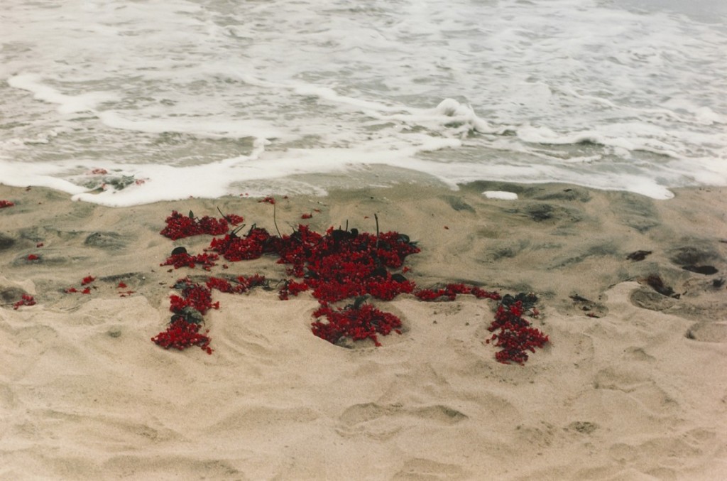
My most transient piece in this location was situated in the tidal zone like Mendieta’s (Figure 10), being erased faster than I could create – let alone document – it.

Figure 11 – Matti, Silueto 5 (installation view), 2020, imprint and stones on sand

Mendieta’s guerrilla style is a transgressive political action protesting racism, misogyny, and environmental destruction. When performing a Silueta, she often took friends along to document while watching for the authorities. There were no authority figures for the Nuhiti Interventions but this will change as I explore different locations.

Figure 13 – Ana Mendieta, Ochún (detail), 1981, ¾-inch U-matic colour video, sound; 8:30 min

Another way we differ is in the Cuban Santería religion. Mendieta was exposed to it in her childhood and made it a focus of her work. I was raised as more of a compassionate free-thinker so that is the comparative focus of my work: I don’t set out to create suffering but I don’t limit what I can imagine either.

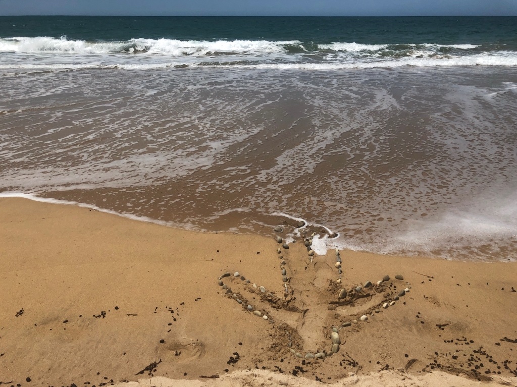
The Ochún Silueta (Figure 13) symbolises the Santería deity of rivers who correlates to La Virgen de Caridad del Cobre, the patron virgin of Cuba and all who brave dangerous waters. Performed across the Florida Strait from her homeland, it is a poignant declaration of here and there, union and separation, earth and water, and the impossibility of being in two places at the same time (León, 2019, paras. 4-5).

Mendieta focused what she felt important, hybridising conventional practices with unconventional ones. For Olga Viso, this was a defining characteristic:

(Her) unrelenting exploration and ultimate abnegation of all forms of boundaries…, her process of making is another aspect of her “between” position. The artist sets in motion a process but does not control its outcome. She allows nature to take its course. She is acted on as much as she acts. (2004, pp. 134-185).

Meanwhile, each of my performative actions is an intimate product of agency, altering the social space and embedding the work into its cultural context: male, masculine, migrant, natural, rural, urban, performative, meditational, physical, metaphysical, entertaining, artistic, conceptual, photographic, sculptural, and transgressive.

Figure 12 – Matti, Silueto 3 (installation view), 2020, bodily impression and driftwood on sand

Bibliography

Baker, E. A. (2016). To Be Magic: The Art Of Ana Mendieta Through an Ecofeminist Lens.

Brett, G. (2004). One Energy. In O. M. Viso (Ed.), Ana Mendieta: earth body: sculpture and performance, 1972-1985 (pp. 181-204). Washington, DC: Hirshhorn Museum and Sculpture Garden, in association with Hatje Cantz.

Hertzberg, J. P. (2004). Ana Mendieta’s Iowa Years: 1970-1980. In O. M. Viso (Ed.), Ana Mendieta: earth body: sculpture and performance, 1972-1985 (pp. 137-180). Washington, DC: Hirshhorn Museum and Sculpture Garden, in association with Hatje Cantz.

Iles, C. (2004). Subtle Bodies: The Invisible Films of Ana Mendieta. In O. M. Viso (Ed.), Ana Mendieta: earth body: sculpture and performance, 1972-1985 (pp. 205-223). Washington, DC: Hirshhorn Museum and Sculpture Garden, in association with Hatje Cantz.

León, C. A. (2019). Trace Alignment: Object Relations after Ana Mendieta. Retrieved from https://post45.org/2019/12/trace-alignment-object-relations-after-ana-mendieta/

Matti. (2019). Carl & Ana: The Breakdown of Artistic Disciplinary Boundaries Since 1960. (BFA). University of New South Wales, Sydney.

Quinn, B. (2017). Broad Strokes: 15 Women Who Made Art and Made History (in That Order). San Francisco, CA: Chronicle Books.

Sabbatino, M. (1996). Ana Mendieta: Identity and the Silueta Series. In G. Moure (Ed.), Ana Mendieta (pp. 135-166). Barcelona, Spain; Galicia, Spain: Ediciones Polígrafa; Centro Galego de Arte Contemoránea.

Viso, O. M., Mendieta, A., Herzberg, J. P., Iles, C., Brett, G., Roulet, L., . . . Miami Art Museum. (2004). Ana Mendieta: earth body: sculpture and performance, 1972-1985 (O. M. Viso Ed.). Washington, DC: Hirshhorn Museum and Sculpture Garden, in association with Hatje Cantz.

LOVEYOUTOO

You will remember from the previous post, that the next post was going to be called LOVEYOU but this is the next post and it’s called LOVEYOUTOO. There’s a reason for that and I’ll get to it later.

To recap: drawing, flowers, superflat, colour, counting.

According to the course outline, Assessment 2 wants us to “continue to practise the processes of spatial construction already tested, developing and refining more complex and creative responses that introduce elements of sequencing and narrative.”

To wit: draw more flowers, with a story.

So, the last post left me conceptualising what I would draw. Narratively, all I could think of was the event that had hung over my life for the previous two years: my mum’s death. The only story I wanted to tell was about my presence in her life and her presence in mine.

I used this as a jumping off point to develop my previous experiments into resolved drawings.

The first thing I knew was that if I was going to do this right, I would need a bigger piece of paper. I had a 1500mm wide roll that’d been taking up space under the bed so I cut a square because the flower motif is essentially circular and will fit inside a square more comfortably than a rectangle.

I spent a long time shopping for refillable pens because I anticipated using a lot of ink but they are few and far between; also, I wanted the marks to have the look of a fine, felt-tipped pen. Eventually I settled on single-use Stabilo Point 88 pens for the finest nibs (0.4mm) and the largest range of suitable lightfast ink.

For reference I used the following colours:

  • 024 Neon Yellow
  • 22 Night Blue
  • 32 Ultramarine
  • 33 Apple Green
  • 41 Blue
  • 54 Orange
  • 55 Violet
  • 56 Pink
  • 89 Ochre

I used our Studio Art Practice studio on campus because of the large tables but I started on the floor, sketching a large flower motif in graphite then filling in the petals with 630 yellow ink flowers, erasing the pencil as I drew to generate the satisfied sense of a job completed. I figured I would need the encouragement as this would be a long task.

Also, it’s hard to see neon yellow on white paper without my glasses but I can’t wear them for long periods of time so I crushed the life out of the first pen by pressing too hard to make thicker lines that I didn’t even need. And as other colours were added, the yellow will stood out more clearly. Art is a learning process!

Figure 1 – Matti, 6350 Flowers (LOVEYOU) progress view, 2020, pen on paper

My parents fostered in we kids a great love of nature through gardening, visits to friends’ gardens, expeditions to wild places, and excursions to the country. Later, when mum couldn’t get out as much as she wanted, she told me she really enjoyed the many photos of flowers that I shared on social media. That made me really happy because she was ever my hardest critic and most ardent supporter. It was good to return some joy.

As I drew, I recalled the final words my mother said to me before she died. It becomes a Zen mantra, bringing calm and focus. I liked it so much that I decided to work them into the drawing sometime later.

Figure 2 – Matti, 6350 Flowers (LOVEYOU) progress view, 2020, pen on paper

Then there was a coronavirus lockdown and most of the buildings on campus were locked. The one large room that was open just happened to have some big tables, so I moved my practice to the student union (Arc) common room.

Once I’d completed the flower background, I began writing “LOVEYOU” with one letter in each flower heart.

Figure 3 – Matti, 6350 Flowers (LOVEYOU) progress view, 2020, pen on paper

This required cushions so I could reach the centre of the paper from every angle. Attaching the paper to a wall would’ve been just as challenging because of the range of heights at which I’d have to work, not to mention all the twisting and turning.

For the text, I chose colours close to the background flowers, making it invisible until you approach the work quite closely.

Figure 4 – Matti, 6350 Flowers (LOVEYOU) progress view, 2020, pen on paper

I like surprises.

Figure 5 – Matti, 6350 Flowers (LOVEYOU), 2020, pen on paper, approximately 151.4 x 151.4 cm

I’m sorry about the quality of the image but I only had access to a phone camera because of the coronavirus lockdown. Also, squeezing a drawing that’s one and a half metres on a side into a computer screen doesn’t allow for fine detail.

Then I had to think about doing a second picture that responds to the first in conversation.

Figure 6 – Matti, 6350 Flowers (LOVEYOU) detail view, 2020, pen on paper

Far Too Many Words

In starting this piece, I wanted to return to the loose and informal drawing style with which I started Assessment One as this work represents me, in the same way that 6350 Flowers (LOVEYOU) represents my mother.

Figure 7 – Matti, 6350 Flowers (LOVEYOU) detail view, 2020, pen on paper

I adapted an exercise from Drawing 1, holding five marker pens – four black and one blue – in one hand (big hands come in useful) and using them to sketch the outline of a flower onto another 150 x 150 centimetre square of paper.

Figure 8 – Matti, 20100 Flowers (LOVEYOUTOO) progress view, 2020, pen on paper, 150 x 150 cm

The pens weren’t always in full contact with the surface because they all had chisel tips so I went over the outline a few more times with the blue pen and the largest black pen.

Figure 9 – Matti, 20100 Flowers (LOVEYOUTOO) progress view, 2020, pen on paper

Then I started filling in the flower.

About this time, the entire campus was locked down so my workplace moved to a drawing board on the loungeroom coffee table as it allowed for the paper to unroll over the sides (so I can reach the middle).

I filled the heart first, and then started on the petals.

Figure 10 – Matti, 20100 Flowers (LOVEYOUTOO) progress view, 2020, pen on paper

I’ve noticed that the repeated and overlaid yellow motif reminds me of a succulent (Sedum acre aureum “Gold Mound”) outside my kitchen door.

Themes I Have Noticed in this Project

  • Pop Art
  • Mass repetition of a motif
  • Subverting the line by using objects rather than points
  • Word Art
  • Conceptuality: conversation between the two drawings representing the conversation in the text representing the conversation in real life
  • The personal in art
  • Self-directed art therapy
  • Symbolism: flower images carrying information (words, emotions)
  • Representation: semi-wild florescence of a herbaceous border
Figure 11 – Matti, 20100 Flowers (LOVEYOUTOO) progress view, 2020, pen on paper

The Biggest Number I’ve Yet Counted To

This time, I restricted my palette to seven colours: orange, ochre, yellow, green, blue, purple, and dark blue. That’s two less than I started with so quite a challenge. I added a ribbon of green flowers to soften the black outline and form a gradient from yellow petals to blue background.

Figure 12 – Matti, 20100 Flowers (LOVEYOUTOO) progress view, 2020, pen on paper

I also let the small flowers bleed together to further soften the edges of the main flower.

Figure 13 – Matti, 20100 Flowers (LOVEYOUTOO) progress view, 2020, pen on paper

When I began adding text I decided to make the words a linear feature to mirror the black lines and further soften the transitions.

Figure 14 – Matti, 20100 Flowers (LOVEYOUTOO) progress view, 2020, pen on paper

From a couple of metres away they will look like more flower motifs but as you approach they’ll resolve into words.

Figure 15 – Matti, 20100 Flowers (LOVEYOUTOO) progress view, 2020, pen on paper

I also expanded orange flowers in the heart to match style of the petals. I like the way everything overlaps with motif flowing into text flowing into line. It suits the symbolic nature of the work which has emotion flowing into flower flowing into word.

Figure 16 – Matti, 20100 Flowers (LOVEYOUTOO) progress view, 2020, pen on paper

These works now exist as a diptych (one picture across two surfaces) as it is a literal and symbolic conversation between my mother and me; her gift of love expressed in word and flower, received, transformed, and returned.

Figure 17 – Matti, 6350 Flowers (LOVEYOU) and 20100 Flowers (LOVEYOUTOO) installation view, 2020, pen on paper, each approximately 150 x 150 cm

I like that the drawings match our characters: mum’s is more subtle and restrained, mine is bolder and looser. I liked drawing on large supports but it is so much easier with a proper studio to work in. I particularly like the multi-pen outline technique and the use of text as a visual device rather than just an informative one. Meanwhile, the outer square of text in 20100 Flowers makes an interesting framing device.

The installation view is outside (on my neighbour’s wall) and includes elements of nature (weeds, leaf shadows). This adds a new layer of meaning about being outside during the COVID-19 lockdown.

Figure 18 – Matti, 6350 Flowers (LOVEYOU) detail view, 2020, pen on paper

With regards my artists from Assessment One, in the first image I have definitely achieved flatness, even with the warm/advancing and cool/receding colour scheme. The outline on the second gives a clear differentiation between foreground and background but the depth remains very shallow. The dark diagonal swathe is because I picked up the wrong pen while in a gloomy room; then I had to work around the purple blob to make it more aesthetic but it echoes the final work from Assessment One. I quite like the contrast and might create a full purple background in a future work.

During the virtual group presentation, one classmate said that the pictures read like a love letter, especially because of depth of time referred to in the work (from my birth through to mum’s death).

Figure 19 – Matti, 6350 Flowers (LOVEYOU) detail view, 2020, pen on paper

The following videos demonstrate the effect of moving toward the images:

6350 Flowers (LOVEYOU) detail: https://vimeo.com/user112839375/review/408703332/243e69a7d8

20100 Flowers (LOVEYOUTOO) detail: https://vimeo.com/user112839375/review/408703480/bd2844115a

Figure 20 – Matti, 20100 Flowers (LOVEYOUTOO) detail view, 2020, pen on paper

Katrina said the Pop Art flower motif became a signature symbol and “a great strength” in my practice. This pleases me greatly as they flow from my hand quite naturally, even by the twenty thousand (yes, “twenty thousand”).

Theo said that the textual element is “a really nice addition” while the loose lines make the second piece “visually striking and interesting both from a distance and up close”. A speculated third work will include both elements.

Ironically, I created the most superflat quality once I stopped trying to draw like Murakami and de Medici, and started using them as inspiration to do my own thing.

Figure 22 – Matti, 6350 Flowers (LOVEYOU) detail view, 2020, pen on paper

More Themes I Have Noticed in this Project

The 0.4 millimetre tips let me draw small flowers en masse; however the paper’s strong tooth (the texture of the surface) completely abraded the felt tip so the metal collar left fine gouges against the surface, but I am surprisingly ok with that. The tools do what the tools do and fighting against that is just an exercise in ego.

Figure 23 – Matti, 6350 Flowers (LOVEYOU) detail view, 2020, pen on paper

I associate flowers with my mother’s gardening and these assessments connected to the last thing she said to me before her death: “Love you.” I wrote “LOVEYOU” (one word because of my dodgy handwriting) on a tally sheet so that every mark would stir my memories. Then, inspired by other students’ use of text in an image, I added lines of LOVEYOU such that they only appear on close examination. The total number of flower motifs and this quote form the title.

Figure 24 – Matti, 6350 Flowers (LOVEYOU) detail view, 2020, pen on paper

The last thing I said to my mother was “Love you, too.” For me, our five-word conversation perfectly encapsulates a narrative that spans two lifetimes. Like many contemporary artists I was inspired by the intimately personal, though I hope the pictures remain accessible even if you don’t know the story behind them.

Figure 25 – Matti, 20100 Flowers (LOVEYOUTOO) detail view, 2020, pen on paper

As self-directed art therapy, I found the drawing process very soothing. Being able to focus on our shared love of flowers for hours at a time has helped me begin processing my feelings of grief and loss.

Figure 26 – Matti, 20100 Flowers (LOVEYOUTOO), 2020, pen on paper, 150 x 150 cm

LOVEYOU

Earlier this year, I painted a mural (Flowers) based on an ongoing love affair with flowers and pop art; Liam told me that it reminded him of Takashi Murakami’s Flowers Red Velvet so I looked that up and yup, it totally would.

Figure 1 – Takashi Murakami, Flowers Red Velvet, 2016, offset lithograph, 59.9 x 59.9 cm

Murakami is best known for creating the “superflat” style from Japanese cultural forms such as ukiyo-e woodcuts, pop art, manga, anime, and kawaii (cuteness). It is characterised by dark outlines and solid, flat planes of colour.

Figure 2 – Takashi Murakami, Flowers Blooming in this World and the Land of Nirvana, 2013, offset lithograph on paper, 49.8 × 49.8 cm

This style happens to resonate well with eX de Medici’s watercolour Asleep while Awake, in which she squeezes all the depth out of bold flora and surreptitious technology. Even though compositional contrasts – mechanical/botanical, cool/warm, pixelated/detailed – push the spy device forward out of the feathery poppy leaves, she subverts this effect by squashing everything into one shallow plane.

Figure 3 – eX de Medici, Asleep while Awake, 2016-2017, watercolour on paper, 98 x 114 cm

I experimented with mixing these works to find a way to make one flower the focal point in a field of flowers, mostly by playing with the imagery and developing sketches past the point where I would normally stop, i.e. until there was literally no room left on the page for mark-making.

Figure 4 – Matti, Flower sketch 1, 2020, pen on paper, 21 x 29.6 cm

I played with different colours and methods of overlapping.

Figure 5 – Matti, Flower sketch 2, 2020, pen on paper, 21 x 29.6 cm

Have I mentioned that I really like lots of bold colour?

Figure 6 – Matti, Flower sketch 3, 2020, pen on paper, 21 x 29.6 cm

These pen-on-paper sketches are fun and generate lots of ideas.

Figure 7 – Matti, Flower sketch 4, 2020, pen on paper, 21 x 29.6 cm

So much fun! I love it when doing art inspires me to do more art.

Figure 8 – Matti, Flower sketch 5, 2020, pen on paper, 21 x 29.6 cm

Unfortunately, my naturally loose style isn’t conducive to replicating the superflat effect. Murakami’s works are too regular to be hand-drawn so, without knowing his process, I digitise some flowers and, after a frustrating session wrangling the printer settings, I manage to create big, flat fields by copying and pasting, pasting, pasting.

Figure 9 – Matti, Digital template 4, 2020, digital print, 21 x 29.6 cm

Kylie suggests that I consider the change to digital as an entirely new medium rather than an automation of the analogue technique and this really helps me understand what I’m doing. She also points out that contrast controls spatiality.

Figure 10 – Matti, Digital template 4 (sketch for flower series), 2020, pen on digital print, 21 x 29.6 cm

It quickly becomes clear that although useful, these A4 tests are too small for me to experience the effect that I’m looking for. Rochelle mentions the increased psychological power of larger images. Katrina also recommends going bigger, but draws my attention to the way that darkening the grey background would increase depth and, conversely, lightening would decrease it.

Adriana agrees that I should move to a bigger surface but suggests playing with a larger palette as the sketches remind her of childhood colouring books. She also has the idea to make a publically collaborative colouring-in work, which coincides with something I’ve been toying with for when I have more time. Ahaha.

Figure 11 – Matti, Digital template 3, 2020, digital print, 21 x 29.6 cm

I try mixing up the size and shapes of the flowers.

Figure 12 – Matti, Digital template 3 (sketch for flower series), 2020, pen on digital print, 21 x 29.6 cm

I try adding colour and shade. Rhea proposes that lots more colour would be another way to confuse depth perception. I colour in some flowers and it certainly flattens the image.

Figure 13 – Matti, Flowers, 2020, pen on paper, 21 x 29.6 cm

But then, while attending the Japan Supernatural exhibition at the Art Gallery of NSW, I come across this kimono pattern (when I’ve finished bingeing on the massive Murakami works and am in the little shop by the exit).

Figure 14 – Detail from IXXI Kimono with Cranes (double-sided), 80 x 100 cm. Rijksmuseum, Amsterdam.

The repeated bird motif creates the same flatness. I decide to fill the frame with small flowers and plop a big one on top, just to see what it will look like.

Figure 15 – Matti, Digital test 1, 2020, digital print, 21 x 29.6 cm

Doink! Close, but no banana. Next, I try moving the focal flower behind the background.

Figure 16 – Matti, Digital test 2, 2020, digital print, 21 x 29.6 cm

Much better; more like de Medici. Sometimes though, I accidentally push a lot of wrong buttons and create interesting effects…

Figure 17 – Matti, Digital test 3, 2020, digital print, 21 x 29.6 cm

Ahem. I don’t know how I did that as I was actually trying to make the background black.

Figure 18 – Matti, Digital test 4, 2020, digital print, 21 x 29.6 cm

And then I try a grey background with serried ranks of overlapping flowers because life is short and why not mix it up a little?

Figure 19 – Matti, Digital test 5, 2020, digital print, 21 x 29.6 cm

That gives it a sense of movement which might be fun to play with later. Eventually, I increase the size to A3, which means doing battle with the out-dated printer at the library. I prevail but only after much hassle and some piquant commentary on the presence of antiquated technology in a school of art and design.

Figure 20 – Matti, 2411 flowers I, 2020, digital print, 29.7 x 42.0 cm

I love how the big flower becomes lost in the field of small ones.

Figure 21 – Matti, 2411 flowers II, 2020, digital print, 29.7 x 42.0 cm

I colour the hearts with yellow marker pen because they remind me of daisies even though they’re actually generic flower motifs.

Figure 22 – Matti, 2411 flowers II detail view, 2020, digital print

This is interesting but there is something missing. I begin a second version, this time colouring the background light grey to add just a little depth.

Figure 23 – Matti, 2411 flowers III, 2020, digital print, 29.7 x 42.0 cm

It only takes this one corner to realise that I will go crazy trying to finish it by hand: it will be easier to redo the template.

Figure 24 – Matti, 2411 flowers III detail view, 2020, digital print

Remember: copy and paste and copy and paste and copy and paste is your friend.

Figure 25 – Matti, Different flowers template, 2020, digital print, 29.7 x 42.0 cm

It’s a good thing I have a comfy computer chair because I’m spending a lot of time sitting in it. Finally, it’s time to colour the hearts yellow.

Figure 26 – Matti, Different flowers I, 2020, pen on digital print, 29.7 x 42.0 cm

And at last, I can colour the heart of the focal flower a contrasting blue.

Figure 27 – Matti, Different flowers II, 2020, pen on digital print, 29.7 x 42.0 cm

And this doesn’t work at all.

Figure 28 – Matti, Different flowers II detail view, 2020, pen on digital print

The cohesiveness of the design is completely undermined by the attention-stealing dark blob. However, I have learned a few things:

  1. The final image size needs to be at least A1 to have the visually overwhelming effect I want.
  2. The central flower will contrast by being uncoloured.
  3. I will remember to count the number of flowers for the title and because it’s fun. I love to count.
  4. Limiting the motif sizes and colour palettes is best for limiting the depth but this doesn’t connect to de Medici’s work.
  5. I reached a fail point when I made the focal flower too obvious. In de Medici’s painting, the weapon harmonises with the surrounding foliage through a contained and muted watercolour palette.

Seeking further inspiration, I go to the library to do some research and discover Murakami’s manifesto, in which he straight out says what superflat means. Libraries are awesome!

Meanwhile, class comments remind me that I like lots of colour so I colour the multitudinous outlines of my A3 print with a bunch of pens I have lying around (because in art, being random generates answers you didn’t know you could ask about – this is a good thing).

Figure 29 – Matti, 2411 flowers IV, 2020, pen on digital print, 29.7 x 42.0 cm

This change in technique allows me to be freer with my colouring and looser in application, as with my original experiments.

Figure 30 – Matti, 2411 flowers IV detail view, 2020, pen on digital print

This version also looks more like eX de Medici’s detailed foliage. And with that realisation, it is time to go large.

I get an A1 version printed and I’m immediately impressed by the increase of scale. I gather all my marker pens and create flowing ribbons of colour.

Figure 31 – Matti, 5020 Flowers, 2020, pen on digital print, 84.1 x 118.9 cm

The uncoloured central flower definitely draws the eye but then you get distracted by the swooshes of colour and you can’t focus on one part for more than a few seconds and it’s like falling into an explosion at a rainbow factory, which sounds like a very good thing to me.

I also remember to count the flowers (there are 5,020) and make my best ever tally mark while doing so.

This first assessment is designed to lead directly into the second, which is a great way to learn about developing a work over time by repeatedly playing with your materials, tools, and techniques. It also underlines how beneficial it is to start your university assignments as early as possible because there are things you miss out on when you rush to do them at the last minute.

You might be wondering why this post is titled “LOVEYOU”. I’d be surprised if you weren’t; I haven’t mentioned love at all. I’m not trying to be inscrutable but the important thing is that you understand that everything you’ve just read leads me to the point where I start conceptualising the next stage: my Assessment 2 picture called 6350 Flowers (LOVEYOU).

Stranger Thongs

One of our assessments in Drawing 1 was to present 30 discovery drawings of the same everyday object on a consistently sized and oriented ground (i.e. the material you draw on).

Matti, 31: 2x 3-line inflating outlines, 2019, pen and crayon on paper, 297 x 420mm

“Significantly, the task also facilitates the development of an expanded vocabulary of drawing, requiring the experimentation and exploration of new processes and materials, new informational systems and ways of creatively representing and interpreting forms.” – Assessment Brief, 2019

Matti, 15: After Vernon Ah Kee, 2019, pen on paper, 297 x 420mm

I chose to focus on a sinister Billabong thong (aka jandal/flip-flop) – left behind by Lukas when he moved away – because I thought it had an interesting shape and wouldn’t be too difficult to draw. Ahahaha.

Matti, 43: Aluminium foil rubbing: Telstra pit cover, 2019, aluminium foil, 297 x 420mm

It was such a simple shape that there were very few ways to present it that didn’t look just like every other way. On top of that, it kept looking like an icon of a thong rather than a drawing of a thong. Since I couldn’t see a way to explore it in depth I began thinking laterally. Then I woke up at 2 o’clock in the morning with ideas falling out of my head faster than I could write them down and ended up with 150 directions to go in but I could only do 90 drawings with “interpretative, stylistic, technical, and material diversity” before I had to hand the project in. Such is life.

Matti, 68: Will’s towel, 2019, bleach on cotton towel, 376 x 550mm

Also, this is drawing in the expanded field – an outgrowth of the big mid-20th century contemporary art revolution – so the definition of drawing is pretty loose: “marks on a surface”. What marks? What surface? What technique? What materials? They’re all defined by the artist so you can draw with graphite pencils on paper, flame on baking paper, holes in cardboard, bumps on aluminium foil, bleach on a towel, coffee on a t-shirt, water on concrete, or light on a screen rendered in ink on paper and you’re still doing a drawing.

Matti, 60: Haiku (light), 2019, digital print, 297 x 422mm

How did things get this way? There was a mindset in the post-war period that the old rules – which were part of the cause of WWII – shouldn’t be above interrogation. Not only that, they should be actively interrogated.

Matti, 87: Digital collage 3: success, 2019, digital print, 300 x 425mm

Once you let one question in, there’s no stopping them. And then you realise that the old definition of drawing was arbitrary, based on available materials, traditional methods, and what teachers could teach their students. There was a hierarchy that favoured the old ways and everyone followed it until someone didn’t and that was that.

Matti, 79: See-through thong and logo, 2019, digital print, 300 x 425mm

If you make an accurate definition for drawing, you will always end up with “marks on a surface”. If you posit “pencil on paper” then you exclude ink as a material. If you include ink, then you have to include paint, which is just a thicker type of ink, so now you have now included painting as drawing.

Matti, 73: Repeated logo, 2019, digital print, 300 x 425mm

If you’ve got painting as a drawing technique, then other forms of applying liquid to a surface are also included. Printing, digital printing, wet photography, dyeing, rubber stamps, and painting stained glass windows are now drawing.

Matti, 71: Digital camouflage, 2019, digital print, 300 x 425mm

If you make the definition “rubbing against a surface” then you include graphite pencils, coloured pencils, crayons, charcoal, and silverpoint… also beetroot, tea, blood, rocks, erasers, brass rubbings, and rubbings into aluminium foil.

Matti, 36: After Vaughan Rees 1, 2019, pen and ink on paper, 300 x 425mm

Since we included charcoal, we have to include soot (they’re both the unburned by-product of fire), which means you can include flame as a material as it leaves soot on the paper.

Matti, 64: After Vaughan Rees 2, 2019, pen and ink on paper, 300 x 425mm

And then you start getting abstract. “Using writing techniques to make a picture” includes pen on paper but also vellum (aka parchment, made from animal skin) which means that tattooing – ink on animal skin – is drawing, as is wearing make-up, body painting, dyeing your hair, and getting a piercing. If the concept makes the drawing, then a URL or QR code which links to a digital image is a drawing (get your phone out and try the one below).

Matti, 78: QR code, 2019, digital image, 300 x 425mm

The QR code links to a downloadable version of the digitised ink on paper drawing that I used for 71: Digital camouflage (see above). You can print it out and colour it in, which would mean that the virtual image on this website is also, simultaneously, an “ink on paper” drawing in your house. This is where Conceptual Art starts messing with your mind. 🙂

Matti, 79: See-through thong and logo, 2019, digital print, 300 x 425mm

Remember “pencil on paper” as a definition? Well that paper surface includes baking paper, toilet paper, tissue paper, newspaper, cardboard, egg cartons, and cardboard boxes. As paper can be made from different plants, you have to timber, papyrus, leaves, canvas, cotton, and linen. Then you have to add artificial fibres like polyester, acrylic, acetate, nylon, and lycra. Paper can also be made from stone, which means all rocks and metals are in. Some printing techniques use wet paper, which means that you can now draw on water, which is made from gases hydrogen and oxygen so you can now draw on air. (Ever seen a skywriter?)

Matti, 81: Scanned underside, 2019, digital print, 300 x 425mm

Is everything drawing? Of course not; sculpture isn’t drawing, it’s chipping away at marble, which is making marks on rocks… which we’ve learned is drawing. What about film? Film uses light to record an image on a piece of celluloid, and then we shine light through it again to project an image onto a screen. Is that a mark on a surface? Permanency isn’t required to make a drawing and if you leave a book on your newspaper in the sun, you’ll see the outline of the book bleached into the newspaper: marks on a surface. Video is just film by another technique, and TV is a projection onto a surface, as is a computer screen.

Matti, 82: Scanned topside, 2019, digital print, 300 x 425mm

If putting liquid on plant material is drawing, then putting jam on toast is drawing. What about curry on naan? What about ice cream in a cone, or hundreds and thousands on chocolate on ice cream in a cone?

Matti, Pinpricks 2, 2019, large needle holes in paper, 300 x 425mm

It’s at this point I realised that if I can make a reasoned argument for something being a drawing, then it is a drawing and I’ve discovered the answer to the question I didn’t know I was asking until I wrote this: What is Contemporary Art?

Matti, 70: Perspective, 2019, chalk and charcoal on paper, 300 x 425mm

Contemporary Art is the process of liberating your creativity, freeing you to explore what interests you in whatever ways you can imagine. And that is the subject of my first solo exhibition, Stranger Thongs at AD Space, UNSW. It opened with 94 drawings just before the campus went into coronavirus lockdown. With the drawings locked in the building, my show has become the longest running in AD Space history!

A Symbolic Self-Portrait

This is a second self-portrait based on the same yellow selfie as my tonal self-portrait but this time I applied an expansive, symbolic abstraction instead of a reductive, representational one.

I started with a found canvas that was already painted bright yellow and there were at least two layers underneath – an eye and a face – but I didn’t know what sort of paint it was so I applied gesso to make sure the next layer would stick, and then painted it with yellow acrylic.

Next, I applied metallic magnolia with a plastic bread bag to represent my presence in the photo (it was the only dark colour I had available that even kind of matched what I was wearing). The bread bag was because I’m not just mental, I’m experimental! Seriously though, it lets me get really gestural without worrying about strokes and angles of attack and too much or too little paint on the brush. It’s an extremely liberating technique because I can’t make a precise mark on the surface whatever I do so I automatically give myself permission to not even try.

 Also, I’m painting upside down because it makes me look at and think about the image as a collection of shapes and tones rather than specific objects like eyes or ears. This is more useful when I’m painting figuratively but also comes in handy on something super abstract where I’m trying not to make specific shapes at all.

Next, I added some metallic fuchsia and collaged in a few buttons, shoe laces, and Christmas trees, followed by throwing around a few more layers of paint, much of which went on the canvas rather than the furniture and pot plants in the courtyard.

Then I glued on sparkly Christmas decorations followed by gold and silver glitter glue drawings followed by pressed bougainvillea bracts/flowers.

How is all this symbolic? Because it’s a self-portrait; everything in the painting represents me as much as the photo does.

  • Found canvas: I collect street treasure (a dozen canvases in the last year)
  • Yellow: the colour I painted the walls of my bedroom
  • Metallic colours: bling that matches the blooming bougainvillea in the courtyard
  • Buttons and shoe laces: the clothes I’m wearing in the photo
  • Christmas decorations and glitter: it was late November which seems to be the start of Christmas these days
  • Bougainvillea flowers: my little plant was dropping flowers all over the courtyard

So, clearly this is a self-portrait, symbolically.

Finally, I installed the finished work at uni by hanging it from the ceiling with hooks and fishing wire, taking full advantage of the great lighting so it floated trippily in front of the wall, slowly wafting as people walked past.

Matti, Symbolic Self-Portrait, 2019, acrylic, glitter glue, plastic (buttons, shoe laces, and Christmas decorations), and bougainvillea flowers on found canvas, 99.5 x 75.0cm, installation view

Reduced Palette Portraits

This project began as one thing then became something totally different that I hadn’t even imagined.

My original intention was to develop an easy way to convert a digital photograph of a black and white print into a reduced-palette sketch that I could use as the foundation of an analogue collage. Got that?

Unnamed artist, portrait of Isobel Coulston, circa 1950, silver gelatin print, approximately 35 x 28 cm

This portrait of my mother as a young woman has long been part of the family’s history even though we didn’t know much about it. The artist is possibly a photographer she worked for in Sydney’s Kings Cross (very different in those days!) or perhaps my father, who was also an avid photographer.

Matti, preparation for Portrait of Isobel Coulston, 2019, digital image, 3482 x 2803 px

I opened the photo in a painting programme and used a tool to reduce the palette from 46,864 colours to 6, the number I wanted to use in my collage. This also necessitated converting the file from jpg to gif as the jpg automatically increased the palette to 7,537 colours; I assume that the format uses a lot of intermediate tints, shades, and hues to blend the transitions between colours.

To make the digital painting look more like a screen print – so I’d have blocky areas that would be easy to fill in a kind of “collage by numbers” – I needed sharply defined transitions and found myself continuously making decisions about where to draw the line (bahahahaha) as I painted in the different colours. Although I started with big brushes, I always ended up decreasing the size until I was drawing individual pixels, just to keep the lines clean and smooth. This is a very intensive process that took more than 12 hours over several days to complete.

Matti, preparation for Portrait of Isobel Coulston, 2019, digital image, 3300 x 2604 px

As you can see, the final drawing bears a strong resemblance to the source photo but your eye is drawn to the darkest colour: the bistre (very dark yellowish brown) irises. I like that serendipitous effect but there’s not enough detail elsewhere and the blocky parts are too blocky. Then I started on another photo from the same shoot to see what would happen.

Unnamed artist/s, portrait of Isobel Coulston, circa 1950, paint on silver gelatin print, approximately 35 x 28 cm

Parts of the source image have been hand coloured, such as the make-up and jewellery, and the hair has also been extended. Mum was a professional colourist around the time the photo was made so she probably did it herself. Incidentally, this is one of the origins of “colour splash”, a digital photographic technique where most of an image is converted to black and white while a small area, such as a red shirt, retains its original colour (I’ve been playing with that technique, too, but that will be the subject of its own post). This is old school cool.

Matti, preparation for Portrait of Isobel Coulston, 2019, digital image, 3899 x 2780 px

For the first version, I reduced the palette to 16 colours as an experiment. I couldn’t figure out how there were so many different colours in a black and white photo but then I remembered that it was actually an up to 16-million colour digital image of a black and white analogue photo.

The image started with 112,883 colours because of the painted areas and gradations; the algorithm that reduces the palette has to keep red for lipstick and fingernails, green for jewellery, and pink for skin as well as black and white. In actuality, the palette stayed mostly within the brown spectrum with black replaced with “Seal Brown” and white with “Alabaster”. There are also greens like “Tahuna Sands” and “Grey Asparagus”. I kid you not.

In this transitional image (note that I haven’t finished blocking the hair yet) you can see that the palette reduction has created contour lines. These intermediate colours have been reused by the programme to create highlights and shadows. It’s a completely prosaic action but accidentally gives an exciting sense of dimensionality.

I get vibes of Andy Warhol’s Marilyn Monroe and Shepard Fairey’s Hope poster of Barack Obama, both extant influences in the aesthetic areas of my brain.

Matti, Portrait of Isobel Coulston I, 2019, digital image, 3724 x 2596 px

I really like the completed image. The pose gives a strong triangular shape but the gaze out of the picture frame breaks the composition. There is plenty of detail in the face but it is surrounded by lots of negative space to ease the eye. The dynamic range of light and shade created by the high key lighting gives power and drama.

Having learned many things from this portrait, I went back to the first work and started again to see what would happen. This time, I converted the black and white photograph to 16 colours before blocking out the different areas.

Matti, preparation for portrait of Isobel Coulston, 2019, digital image, 3296 x 2600 px

I was wary of the fine details, such as the eyelashes and jewellery, as they’d caused much angst the first time. You can only make a finite number of good decisions in a day and this process uses up all of them!

One of the better decisions I made was to remove the entire background and replace it with a darker colour, reducing the overall brightness of the image, softening the look, and pushing the subject forward.

Matti, Portrait of Isobel Coulston II, 2019, digital image, 3296 x 2600 px

The original portrait captured mum’s bubbly nature and some of her wicked sense of humour. My contour lines make it somewhat abstract and I’m fascinated by the push/pull between photographic fidelity and digital weirdness. Eyelashes remain the least satisfactory aspect because in real life, the fine detail disappears or becomes overstated. The necklace chain is perhaps a little too photorealistic but I still don’t have a solution that doesn’t involve too much detail with three colours and not enough with two.

Of course, I couldn’t use this image as the basis for a collage, so I was fiddling around with different settings trying to make it more useable and accidentally produced something even stranger: an ultra-high contrast version that increases the vibrancy of the palette and adds emphasis to the darkest areas. Wow!

Matti, Portrait of Isobel Coulston III, 2019, digital image, 3296 x 2600 px

I haven’t done any collages of these pictures; mostly driven by the difficulty my supplier has in sourcing bulk, metallic, star-shaped stickers. I have, however, completed another 20-odd transformations; I’ll be showing these in my Instagram feed over the next few months and working on some more photos I’ve identified as likely candidates.

Flowers, 2020

I have a thing for flowers. I can’t get enough of them and I can’t photograph them enough. I also like to draw them and paint them. I find that the simple, repetitive nature of their design lends them to being the subject of one of my favourite genres, Pop Art.

Pop Art emerged in the mid-1950s as a challenge to elite fine art and as a response to the increasingly prevalent world of popular culture. One influential form was the comic book, with simple designs, cheap materials, easy themes, and a limited colour palette. A major artist working in this area is Roy Lichtenstein, and his 1963 work “Whaam!” was one of my early influences (see Tate).

Another of my favourite mid-20th century genres is Psychedelic Art, in which the artist’s genius is activated through the use of hallucinogenic drugs such as LSD or magic mushrooms. Some effects of a good trip are visions, an intensification of colour, the conflation of images and ideas, and a sense of joy. I was exposed to the kind of art that was produced by my big sister’s record and poster collection. Thanks, sis!

When I saw a call for applications by Arc Art & Design for the Arc Mural Project, I immediately made a concept sketch, digitised it, and then filled it with a few bold colour choices.

I couldn’t be specific because the wall hadn’t been chosen yet (as it turns out, the final mural is some 40% wider so the composition is quite different).

I have a thing for reusing, repairing, and recycling whenever I can so I was rapt to find shelves full of paint left over/donated by other muralists. Also available were drop sheets, brushes, paint tin openers, and a ladder. The only new item I bought was a bunch of paint pens for the comic book-style outlines, bringing me in 85% under budget with a load of carbon credit!

I was given the choice of three walls to paint on, all of which had an extant mural by a former student. I chose the best situated location which featured a work by UNSW alumna, Jamie Parmaxidis. She had also ventured into psychedelic territory, but headed in a very different direction. I’d admired the mind-bending quality of her art since I first saw it last year, but all things must change! One day someone will paint over my mural, too.

After spontaneously chalking up and then base coating my flowers, I started to fill in the background. I knew it would take several coats for the ochre colour to become fully opaque (there’s something about red house paint that makes it somewhat transparent; you even have to use a grey undercoat instead of white). With each layer Jamie’s mural became less visible, but I liked the way persisted in showing through. At this point I made the decision to keep my background somewhat translucent, creating a palimpsest that acknowledges the history of the wall and the presence of previous artists. It also makes “Flowers” look slightly strange as it’s hard to resolve the subtle variations of ochre into anything meaningful. It’s only when you get up close that you can see what’s happening and only if you’ve seen Jamie’s mural that you understand what’s been done.

Meanwhile, I began filling in the flowers in a “randomised” colour pattern, as if a bunch of blooms just happened to tumble across my vision. Even with the base coat, it took three layers to achieve a flat enough effect that emulates the blocky appearance of a comic book cover.

Two weeks after starting, I realised that I’d forgotten to do the hearts of the flowers in contrasting colours, so that delayed completion by a few frustrating days. I did, however, put into practice the trick of wrapping used brushes in plastic so the paint doesn’t dry and you don’t have to rush off to clean each one straight away.

Also, they look delicious.

The first act of inking a comic is to draw the outlines, but painting works the opposite way, making it the penultimate act of this mural. I tried a new technique: Posca paint markers recommended by The Art Scene staff on campus. They’re just like felt-tipped ink pens but are filled with acrylic paint. They were really useful for the outlines and so much easier to use than even the finest brush. I reckon I drew about 200 metres worth of lines from one pen. That’s pretty good value!

The mural took me a couple of weeks to complete, working for 3 or 4 hours on most days. As is usual with a Sydney summer we had bushfire smoke, heatwaves, tropical rain, fog, sunshine, and a leaky awning, so the exposures on the animation I did (above) are a bit “loose”. Still easier than a 2-week time lapse though!

I have a thing for murals and I can’t wait to do my next one.

Matti
Flowers, 2020
Acrylic paint over extant image on concrete
6900 x 2800 cm

Barramundi (2019)

I love street treasure. There’s something about finding someone else’s waste and turning it back into something that is valued and useful that really warms the cockles of my heart.

That said, I’ve been thinking vaguely about painting a surfboard for years but have never gotten around to it. One day, however, things were set to change. The story begins with me discovering a surfboard and carry bag left in a laneway near my house. Street treasure for the win!

I picked it up and brought it home, leaving it out the back because it was too bulky to store inside. Now I could start thinking seriously about what to paint on it.

Meanwhile, my flatmate Chris came home and came across the street treasure. When he saw me he said gleefully “Oh Matti! That’s exactly the kind of surfboard I’ve been looking for! It’s perfect for Amanda to learn on!”

Well, what can you do? I didn’t even know what I was going to paint so I gave it to him to give to Amanda to learn how to surf.

But, as these things go, a couple of days later, Chris told me about another mutual friend, Francisco, who had a damaged surfboard he wanted to paint for his flat. And that’s how Chris arranged my first commission!

We went around to Fran’s place and I checked out the board and where it would hang – context is as much a part of the work as the work itself – and started developing ideas based on things that I knew about Fran.

A surfboard is an iconic shape so I wanted to celebrate the distinctive outline. Fran is a surfer and a fisherman, which led me to the idea of a barramundi, a native Australian fish just the right shape to paint on a surfboard.

The first thing to do was to find a picture of a barra so I sourced an image from the Victorian Fisheries Authority.

Adult barramundi (Lates calcarifer)

I’m not at all into photorealistic painting – and that style wouldn’t suit the board – so I played around with a few abstractive sketches. For some reason I started drawing at the bottom of the page so they’re in reverse order.

Preparatory sketches for Barramundi, pen on paper

I prepped the board by removing the wax with a special cleaner that I got from the local surf shop (Surf Culture) before drawing the outlines in pencil. I tried masking some of the areas but it was super finicky as most of the lines are curves. Ah well, I always did like painting round things.

Next I added an undercoat because acrylic paint doesn’t stick to epoxy very well.

Barramundi undercoat

I based the two-colour scheme on Fran’s beloved bike so everything is blue, which also happens to be one of my favourite colours. I very quickly learned that I should’ve learned how to mask up curves because it turns out that doing all the odd bends and sharp corners by hand was more work than figuring out the masking tape. Also, yes, I did paint the board on the kitchen table as no-one has donated me a studio yet.

Barramundi final coat

The board will be hung with the front (the pointy end) facing left so I used a slightly darker blue on the top half of the board and lighter on the bottom to mimic the countershading camouflage of the barramundi. I purposely left a lot of creamy white to honour the maker of the board, even though they are unknown to me. I like the thought that the board’s history is not lost in the painting.

The next step was to peel off the masking tape (so satisfying!) and see what I’d done.

Barramundi unmasked

It’s exactly what I wanted, but it’s not finished yet. It needs something to draw the two halves together…

Barramundi detail

I used a silver paint-pen to outline the blue areas. Then in finer pen I added scales to the body sections, inspired by Japanese tattoos. The last step was to add a coat of clear gloss to make the board look wetter and just a bit fishier.

Barramundi, 2019, Ink and acrylic paint on surfboard

Here is Fran in the living room with his Barramundi. It will hang on the wall behind him once the hooks have cured. There’s nothing like a happy patron.

UNSW Artsweek 2019

Art Meets Science

Science is art

The works I exhibited as a featured artist in Artsweek 2019 were inspired by exercises done in small scale, exploring abstract forms and repetition.

 2,000 Influenza Viruses
Matti
2,000 Influenza Viruses, 2019
Pen and ink on paper
42.0 x 59.4 cm
The influenza virus is technically not a life-form as it cannot reproduce without a host.

Random input was generated while exercising at the gym to create spontaneous glitches: lack of motor control caused by muscle fatigue between sets, pen and planar disturbance caused by riding a static bicycle, and loss of fine detail caused by not wearing reading glasses.

 1,000 Spermatozoa
Matti
1,000 Spermatozoa, 2019
Pen on paper
42.0 x 59.4 cm
Human spermatozoa (12 of the 1900 sperm in the mandala exhibit abnormal morphology through head size, tail size, and double heads or tails; with just 0.006% sperm exhibiting such deviation this is well below the normal rate of 4-14%) have not, as yet, been seen spontaneously generating mandalas but might well do in an infinite universe.
 2,316 Escherichia coli
Matti
2,316 Escherichia coli, 2019
Pen on paper
42.0 x 59.4 cm
Escherichia coli, several of which are undergoing mitosis.

With a generous eye and a fondness for making meaning, some of the drawings could be said to resemble microscopic unicellular organisms. After researching said organisms – with assistance from Google and my flatmate Chris (who is studying for a Doctorate of Veterinary Medicine at the University of Sydney) – five single-celled “life-forms” were selected to develop into large-scale small-scale pen (and sometimes ink) cartoons.

 4,000 Green Algae
Matti
4,000 Green Algae, 2019
Pen on paper
42.0 x 59.4 cm
Green algae form long chains as the cells divide.
 800 Paramecia
Matti
800 Paramecia, 2019
Pen and ink on paper
42.0 x 59.4 cm
Paramecia (800 cells with a mean average of 29 flagella means the image includes some 23,200 flagella).

Floatation

Local businessman Zac from True Float put posters up at uni, looking for artists who would swap float tank sessions for art. I’ll try just about anything once so I wandered down and made a booking. It was good fun. You really do float on the salt water rather than in it (it’s 40% Epsom salts; the sea is only 3.5% saline). The tank was warm, dark, cosy and had plenty of room.

Just as your body floats on the warm water, your mind floats on your heartbeat as your breath sound flows through your ears. The tank is pitch black (there’s a light if you need it) so you don’t have to look at anything; I shut my eyes for some of the time and there wasn’t any difference. It was very relaxing.

Anyhow, I left still feeling a bit floaty, and over the next few weeks I developed two works: a series of eight drawings and a collage.

Each drawing consists of one continuous line (they don’t show up too well on a screen). The first three are with a 0.1mm pen, the rest are 0.2mm as it made a clearer mark. Each picture is inspired by the flow of water in the tank when I first got in (it settles to perfect stillness pretty quickly though). They also reflect different brainwaves and the way my thinking ebbed and flowed in the dark: at times anxious, calm, and inspired. Zac referred to VIII as “definitely overthinking it”. Lol.

Every collage becomes real when you glue the first piece of paper. After that, there’s no going back, you’re committed to finishing (a bit like a jigsaw). Yes, I’m working on the coffee table in the lounge room at home. I really do need a studio. And generous patrons out there want to set me up?

This piece took about eight hours all up; cutting pieces of paper into triangles and gluing them down takes a lot of time! I decided on isosceles triangles because they have direction and provide psychological impetus. To save your brain, I made an animation so you can see it developing.

Time lapse showing the development of Floatation

The white dot is the lid of the glue stick: a reference point for the circular fields and also useful for colour-balancing the photos as there’s no white in the frame. My pasting method was to work outward blocking the different colours then turn back inward blending the edges and filling in the gaps. Here is the final work…

Matti, Floatation (2019), paper on foam board, 42.0 x 59.4cm

You’ll notice that it’s round the other way; that’s because I made it upside down. I find this helps me to not pay attention to details and just look at the big picture. Bahahahaha! But seriously folks, I would otherwise get carried away trying to make everything look perfect rather than be guided by the materials and process.

My inspiration came from something I “saw” or “envisioned” while floating: a small but intense purple light over my head. I thought it was part of the tank until I got out and saw there were no lights like that, purple or otherwise. Rather than have a dot in the middle of blackness, I inverted the concept and had a small black circle in a sea of blue and purple.

Interestingly, Zac has also seen a purple sphere while floating, so he was quite taken with this work.

My second float was also incredibly creative. Once my mind settled down, I had ideas for future works popping into my head so quickly I’m surprised I remembered them all. I can’t wait to get started!

True Float is at 50 Oxford St, Paddington NSW 2021. You can find out more about them at the website: https://www.truefloat.com.au/.